Rewriting Transmission UI with React
· 6 minutes read · Originally published hereI remember it was about two months ago when I was talking with Eduardo Lanchares about the best stack for the next webapp. Sometimes you are at work and you are stuck with the current set-up of frameworks and tools that are quite difficult to change or refactor. This forces you to always work with the same mentality not allowing you to test new approaches to solve problems.
Following our desire to learn new stuff to make our life easier, we wanted to experiment with new technology to build a side project with a complete new stack that fits better with the app requirements.
In that same week, a friend of mine was talking about a bug that was affecting him in the web client of Transmission. This bug was affecting more people because we found an open bug report in the tracker that was 2 years old. We decided to check the source code and try to fix it because we thought that would be a piece of cake. But a few hours later we discovered that was not as easy as we expected and at some point we gave up.
With all these things in mind we had the perfect scenario and excuse to start playing with a new side project. We decided to start building a new interface from scratch to understand new patterns, new approaches and discover what would be the next challenges for the ultimate interface.
Our experimental stack
Reviewing all of the features in the current Transmission web client, the stack we chose was React for the user interface, Mobx for the state management and CSS modules for all the stuff related with the application styles, with a new build process managed by Webpack.
On the other hand, and with the above stack in mind, we decided to use some best practices for the long term quality of this project. Some of these were things like a strict set of Eslint rules, unit tests, UI tests and internationalization.
With this decision we wanted to achieve a more reliable interface, better performance, security and correctness. In conclusion a better way to maintain this web application.
In the following sections we are going to go through a list of differences between the way of developing the original Transmission source code and our approach. If you are curious, you can check the original code and our code.
Components
In terms of application modularization, the original client was implemented with a set of views joined in a single static HTML file. These views were modified by jQuery code to keep it updated. While this approach worked as expected, it had the disadvantage of generating multiple DOM updates, which impacted UI performance. Also, having hard-coded strings in this file made it difficult for supporting I18n as well as dynamic content generation (for instance when displaying available speed limits)
Our new application stores each component in an independent folder for each of them, with all the related stuff within. Things like styles, tests or subcomponents live together. This lets us manage all the application components understanding all the dependencies between them and achieving the best decoupling possible.
State management
In a traditional web application implemented with jQuery you would keep updating all the UI manually, after realizing that some elements were outdated. Those changes would usually come from some user interaction or from server updates, so the concept of application state was almost inexistent.
With the new stack managed by React and Mobx, we follow the one way data flow convention, which makes it easier to reason about the application state. All this state is managed in Mobx containers called stores. This is a really good diagram to understand how it works:
Mobx uses the following main concepts to model your application state:
observableproperties: basic tracked propertiescomputedproperties: derived properties from observable onesactions: methods to update the statereactions: side effects to be executed for each state change
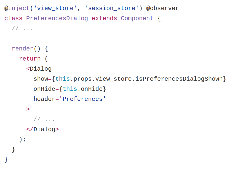
For instance, in the following example, when we click on the preferences
button, we dispatch an action that updates the isPreferencesDialogShown
observable property. That change produces an update in observer components. In
this case PreferenceDialog reacts to this change and re-renders itself,
resulting in dialog shown in the UI.
Styling
For a really long time we have been styling HTML components through a list of CSS classes referenced by class attributes in your elements. New tools have appeared during the last 5 years to improve our life like SASS, LESS or CSS Modules.
If you are used to code big sets of components you can make the common mistake of reuse style classes for different components. But what happens when the styles from those components start to differ? You are in a trouble.
As we said before, in our stack we decided to use CSS Modules to style all our components. We think that this is the best approach to achieve a modular and reusable set of classes. All the required classes for each component live together. This is really good in terms of maintainability because it’s trivial to decouple components. CSS Modules lets you play with composition so you get the best characteristics from both worlds.
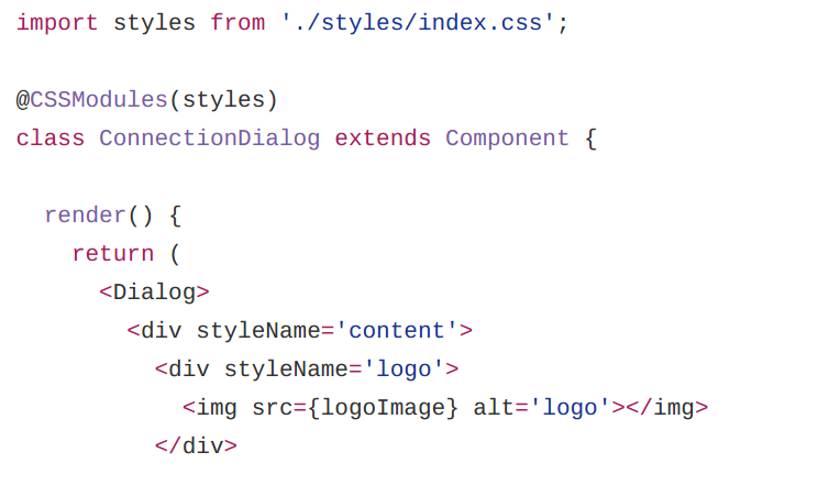
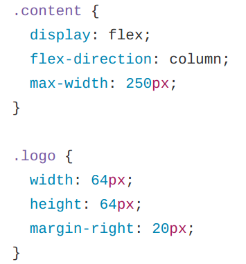
As you can see in the following example we are using two CSS modules references
called content and logo. These names are used to refer classes in the
stylesheet file.
React viewConnectionDialog/index.js:
Style fileConnectionDialog/styles/index.css:
Tests
The original application had no tests at all so it was easy for us to improve that aspect.
In the new application we wanted to test not only business logic but also the UI. For this we opted for the Jest framework and the snapshot testing technique. With this we ensure every component renders what’s expected. This is important because most of the components contain several paths and we need to ensure that each one is covered.
Integrating this new set of tests to some CI we can be more confident about future changes that we apply to the application.
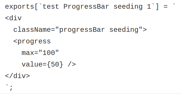
As we can see in this example we are rendering the Progress bar component with mocked torrent data.

Then with the snapshot technique we can ensure that the rendered result is what we expect comparing with previous snapshot. Testing components in this way is a as simple as record JSX code.
Extra features
Reviewing all available features in the original Transmission web interface we discovered broken features like Desktop notifications. We wanted to restore them because we think it’s a really nice feature to have.
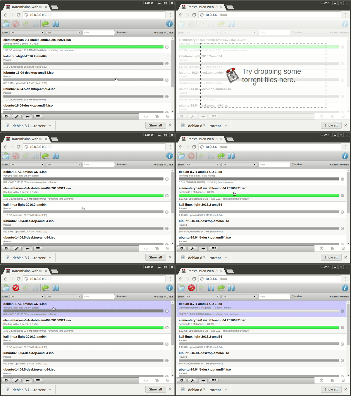
Furthermore, one extra feature that the new interface includes is drag and drop file support for torrent files. This boosts the common use case of quickly adding a torrent file as you can see in this example:
Conclusion
We started this project to play with new technology to be able to understand all the challenges a bigger project would face if you chose some specific stack. At some point we saw how easy was to implement new features that were included in the original interface. So we decided to push forward and set a personal goal: Implement all of them. Today we can say that we’ve achieved 95% of all features.
Our last goal is to present this project to the community to be evaluated. We decided to respect as much as possible the original interface for two main reasons:
- We didn’t want to raise a debate in UI design. So we decided to follow the current design, we just wanted to propose a new code architecture.
- We didn’t want to impact the end users in case that this code were considered for inclusion in the main Transmission repository.
Lastly, even if the project dies out, for whatever reason, we’re happy anyway, because we learnt a lot of things and had a really fun time during its development. :D